Accointing.
Simplifying global crypto tax reporting. A streamlined interface that makes complex calculations clear, accurate and compliant.
- Role
- Sole Product Designer
- Team
- Cross-functional, front & back-end
- Surface
- Web app
- Scope
- End-to-end product
- Period
- 2022 to 2023
Make crypto tax feel less like an audit.
Accointing sits inside the Glassnode product suite, offering automated cryptocurrency tax reporting across multiple jurisdictions. Users connect their wallets and exchanges; Accointing classifies every transaction and generates a compliant tax report.
The catch: transactions break. Wallets disappear. Prices go missing. By the time a user reaches the report screen, they've usually hit a wall of flags they don't understand and can't easily fix.
As the sole designer for Accointing within Glassnode's suite, I led the end-to-end design process, working directly with front-end and back-end engineering to redesign how errors surface and resolve.

The navigation was louder than the work.
The previous side menu lacked hierarchy and overwhelmed users with colour.
- Errors split between Transactions and Review tabs, forcing context switching
- Users struggled to locate key sections under the visual noise of the menu
- Missing-fund flags were the most critical errors, and the hardest to find
- Classification lists were too long; users had no idea what most options meant for their taxes
The cleaner nav tested worse.
Familiarity beat clarity, until we earned the right to change it.
The cleaner option was the wrong first move.
We hypothesised that swapping the side menu for a top-bar nav would reduce cognitive load. Quantitatively, the top-bar performed well.
Qualitatively, it failed. Existing customers were accustomed to the side menu, didn't recognise the new pattern, and reported feeling lost.
We pulled the redesign and committed to a surgical pass: keep the side menu, tame the colour, fix the hierarchy. Same chassis, better engine.
Errors split between Transactions and Review tabs, forcing context switching
Lack of visual hierarchy led users to focus on minor issues while missing critical ones
Long lists, hard-to-track progress, no sense of impact for any single action
The most critical errors for tax accuracy, also the hardest to locate
Lists were long and complex; no descriptions of taxable vs untaxable implications
I drew the whole thing out by hand, step by step.
Before redesigning anything I mapped the existing error-resolution flow end-to-end. Every entry point, every branch, every step a user had to take to get from "I imported my wallet" to "I have a tax report."
The diagram made it obvious: the flow was forking into the Review tab for half of the error types, then forking back. Six steps where two would do.

Every error, resolved in place.
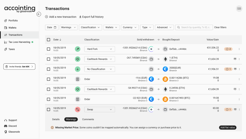
We collapsed the Review tab into Transactions. All flagged issues now live on the transaction list itself. Clicking any warning reveals a detailed breakdown with the actionable fix below it.

What we changed.
- All errors resolved directly in the Transactions tab. No more Review tab.
- Users see every flagged error on the transaction list instead of partial warnings
- Clicking a warning reveals the detailed breakdown with actionable solutions inline
What it changed.
- Centralised error handling. Less navigation, lower cognitive load
- Users now fix multiple issues in one pass, speeding resolution and reducing drop-off
- Lower support volume because errors are easier to find and fix without help
Help users pick the right label.
The classification list used to be a single, long, jargon-heavy dropdown. We split it into Deposit & Withdrawal tabs, grouped by taxable vs. untaxable, and added a short plain-language description below each option.

What we changed.
- Short description under each classification, in plain language
- Split view between untaxable and taxable options
- Two tabs for Deposit and Withdrawal to scope the choice
- Classifications adapt dynamically to the user's jurisdictional tax laws
What it changed.
- Users classify transactions correctly with less effort
- Misclassification errors and downstream tax reporting mistakes drop
- Beginner-friendly without slowing down advanced users
What I'd carry forward.
The A/B test taught the bigger lesson here. Quantitative wins don't always translate to user trust. The cleaner top-bar tested better in isolation, and worse in context, because we were asking users to relearn a tool they already had muscle memory for.
The actual win came from doing less, more surgically: tame the colour, unify the tab, give the dropdown a sentence.
General Metrics & Outcomes